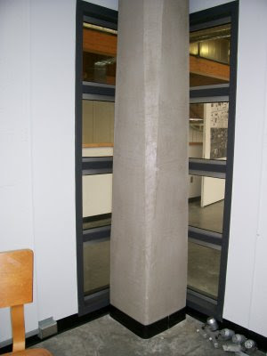
The space is primarily used for critiques, lectures and presentations. It is a space defined by four walls open to a vaulted ceiling containing opaque skylights. It is a medium sized, multifunctional space with walls used for pin-up space. It is a public space, certainly not private acoustically, as sound echoes in and out of the space easily. Looking up, there is a view of the superstructure: exposed beams and an HVAC system bisecting the ceiling plane. The interior is neutral with white walls and gray, concrete floor warmed slightly by wood accents.
The overall lighting quality is unable to be controlled since most of the light is an ambient, natural light coming from the overhead skylights. There are track lights around the perimeter of the room to spotlight the walls. On most days, these are washed out by the abundance of natural light, only casting a soft focal glow on the walls.
The shadows here are soft and without much contrast since the light source (the skylights) are multidirectional. The overall effect is that the lighting is too intense for most people. It does not function well for its intended purpose since there is minimal user-defined control over environmental factors.
The space leaves people feeling somewhat uncomfortable after long periods of time because there is no variation in the lighting- there are no lowly lit corners, shadows, or other instances where a person can seek out their own level of comfort, instead, on a bright day, they feel like they are under a microscope.
Here are a few images from the space in the gatewood Building that our group chose to analyze. I have not adjusted the exposure, so that you get a sense of the intensity of the light as it really is.


As individuals and then as a group, we rated the different qualities of the space on a scale from 1 to 7--the lighting and how it feels to be in the space. The space received an overall rating of 4--right in the middle. I suppose the bright open space is nice, but not in all applications.


