hello. thank you for visiting!
i have received my degree in interior architecture from the University of North Carolina at Greensboro, and am pursuing my career in the design industry.
my website/portfolio:
www.denisesmithdesigns.com
please feel free to contact me, for freelance or other design opportunities.
cheers,
denise
Thursday, October 21, 2010
Monday, May 11, 2009
lighting inspiration continued...
 a light shelf that also acts as a visor/sun shield.
 clear acrylic cylinders suspended from the ceiling --and backlit. cool.
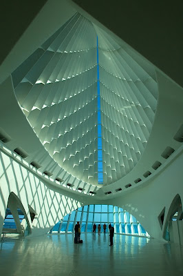
 a museum that allows infiltration of light--all around--through 'gills'.
 a creative chandelier--looks like it's made of driftwood, glass ornaments, and fish tank heaters. inspiration to use what you have.
Thursday, April 16, 2009
Thursday, March 19, 2009
lighting inspiration | articles, images, ads

I'm a New York Times reader. Following are some links to articles that I found interesting:
"A Building as a Beacon for a City's Plans" --Nicolai Ouroussoff
http://www.nytimes.com/2004/12/08/arts/design/08calt.html?pagewanted=1&oref=login
"How Long Did You Say That Bulb Would Last?" --Eric A. Taub
http://bits.blogs.nytimes.com/2009/02/11/how-long-did-you-say-that-bulb-will-last/?scp=1&sq=how%20long%20did%20you%20say%20that%20bulb&st=cse
"'Smart' Streetlights Hit the Streets" --Eric A. Taub
http://bits.blogs.nytimes.com/2009/02/10/smart-streetlights-hit-the-streets/?scp=1&sq=smart%20streetlights%20hit&st=Search
Sunday, March 15, 2009
light series 4 | lamps
 incandescent | luxury bath
a place for daily hygiene & relaxation. all of the lighting is incandescent, which creates a soft, comfortable glow. the recessed lighting over the tub in the vaulted ceiling is angled such that it provides adequate ambient light throughout the bath. the sconce luminaires on each side of the mirror offers nice task lighting for the face. the softness of the lighting--task and ambient--is such that it doesn't have any harsh reflections from the stone surfaces. i would redirect or remove the spotlights that are causing"hotspots" on the back wall and shower areas.
 cold cathode | french connection | retail space
the blue cold cathode is purely for sparkle/play of brilliants and is used to attract shoppers. the down lighting within the showcases provide focal glow for the clothing on th mannequins. they appear to be track lights--hard to see. the focal down lights seem to create some discomfort glare, but the cold cathode works beautifully to attract customers. the down lights are so direct that the light falls directly on the shoulders of the mannequins. some are not illuminated at all. i believe the glare would be resolved by lesser wattage bulbs, and would be more effective for displaying merchandise if they were angled spot lights.
 fluorescent | kitchen | task lighting
purpose-cooking, washing; preparation of food, entertaining.
the lighting over the cooktop and under the cabinetry is for tasks. the lights inside the cabinetry combine duties as task & sparkle. the task lighting under the cabinets creates a nice, rhythmic pattern while highlighting the textured backsplash. the reflections of the light on the stainless countertops accentuates the shine and makes the kitchen look more formal. all of the lighting in the kitchen is 'white', or has a cooler temperature. the lamps over the cooktop are r16's, or pendant lamps; inside the cabinetry, fluorescent luminaires act as downlights and use CFLs; under cabinetry--fluorescent tube luminaires. the illumination appears too bright under the counters, creating a discomfort glare. i suggest reducing the wattage of the lamps.
 metal halide | factory
purpose--production
this is a very typical lighting design for a production environment--a metal halide lamp inside a clear, parabola-shaped reflector which provides great ambient light. the lighting is bright, but not overly glaring, a 'whiter', clearer light for good visibility, monotonous. the light creates a very good overall ambient illumination level, and is bright enough to perform tasks. the color of the light and its reflections on the surfaces make the space appear very cool. i would add some warmer task lighting at work surface level such that the workers could have more personal lighting control.
 high pressure sodium | tunnel
purpose | driving
the ambient lighting within the tunnel seems too "murky" and unclear for the good visibility required for driving. the white lines on the road are hardly visible. it has an amber hue, which would seem distracting, maybe even dangerous for 'older' eyes that do not adjust as quickly. the amber hue is also very 'warm', which further closes the already-closed space. beware claustrophobics!! the single lamps and luminaires create a ring-like effect through the tunnel--distracting. the illumination level within the tunnel seems too low for good driving visibility. LED luminaires would be more suitable for such a space.
 electrodeless | tunnel
purpose | driving
the ambient lighting that the LED luminaires provide within the tunnel seems very clear and provide the good visibility required for driving. the light is white, which provides better clarity and helps enlarge this very closed space. the luminaires are elongated, and installed in groups of 4 which alleviates the 'ring' effect in the high pressure sodium example.
Wednesday, March 11, 2009
daylight model
this was a group project that required us to build a daylight model using inspirations of a renowned designer/architect. other physical requirements were:
we achieved multilateral daylighting through the use of 4 types of openings in this model, which in total create a space for both gathering and quiet contemplation. the impact of this combination of lighting is diverse within the space but is unified through the structures that create this day lit atmosphere.
 our group chose 3 designers: le corbusier--ronchamp; Jorn Utson--bagsvaerd church; and santiago calatrava--tgv station, lyon.


 the ribbed, sculptural elements, inspired by calatrava's work, serve as structural support, and create solids and voids.the arched light shelf spanning through the model was inspired by jorn utzon.

 the smaller arches within the larger arches create a more intimate space for smaller gatherings or quiet contemplation.
- 3/4"=1' scale
- 20'w x 35'l x 15'h
- matte white material; excellent craft
- should include a place for large groups of people, sharing information, socializing, quiet contemplation, spiritual stimulation, intimacy, and escape.
we achieved multilateral daylighting through the use of 4 types of openings in this model, which in total create a space for both gathering and quiet contemplation. the impact of this combination of lighting is diverse within the space but is unified through the structures that create this day lit atmosphere.
 our group chose 3 designers: le corbusier--ronchamp; Jorn Utson--bagsvaerd church; and santiago calatrava--tgv station, lyon.


 the ribbed, sculptural elements, inspired by calatrava's work, serve as structural support, and create solids and voids.the arched light shelf spanning through the model was inspired by jorn utzon.
 the smaller arches within the larger arches create a more intimate space for smaller gatherings or quiet contemplation.
Subscribe to:
Posts (Atom)


